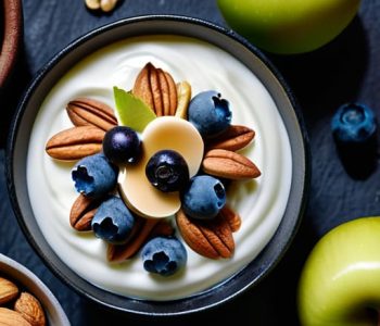
 Food
Food
Deliciously Healthy Snacks You’ll Actually Enjoy
We’ve all been there: it’s 3:00 PM, your focus is tanking, and suddenly that vending machine or a bag of greasy chips starts looking like a legitimate meal. I used to fall into that trap constantly, thinking that staying fueled meant either spending an hour meal-prepping or settling for something that left me feeling completely sluggish an hour later. The truth is, finding actual healthy snack ideas shouldn’t feel like a part-time job or require a trip to a high-end organic market. You just need a strategy that fits into a busy schedule without making a mess of your kitchen.
I’ve spent a lot of time refining a few go-to options that actually hit the spot and keep my energy levels steady while I’m working. In this post, I’m breaking down five simple, low-effort snacks that prioritize efficiency and nutrition. These aren’t fancy recipes; they are practical solutions designed to keep you full so you can stop thinking about food and get back to living.
Table of Contents
The Nut and Fruit Combo
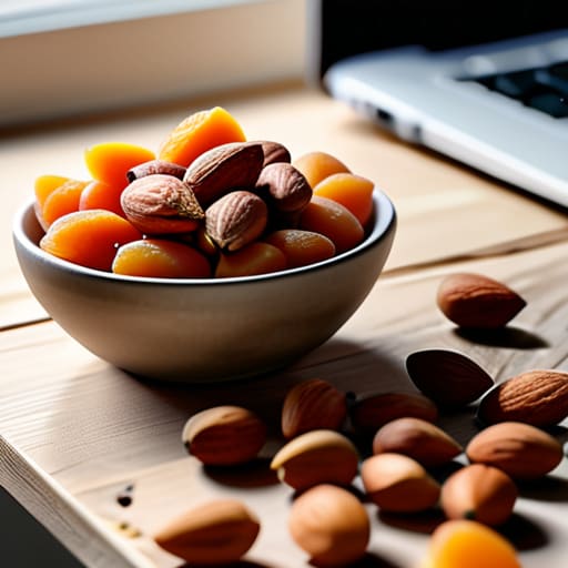
I used to think “healthy snacking” meant spending forty minutes prepping a kale salad, but that’s just not realistic when you’re staring down a deadline. Now, I keep a bag of raw almonds and some dried apricots in my desk drawer. It’s the ultimate low-effort win because it hits that specific craving for something both crunchy and sweet without any actual cooking involved.
Greek Yogurt with a Twist
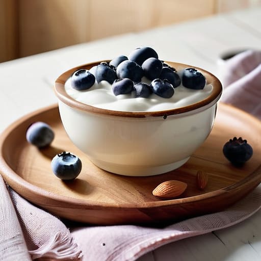
If you have five minutes and a spoon, Greek yogurt is probably the most efficient tool in your kitchen arsenal. I personally grab the plain, unsweetened stuff because it’s cheaper and you aren’t paying for a bunch of hidden sugars that will just make you hungrier later. It’s thick, filling, and incredibly easy to customize on the fly.
Apple Slices and Peanut Butter
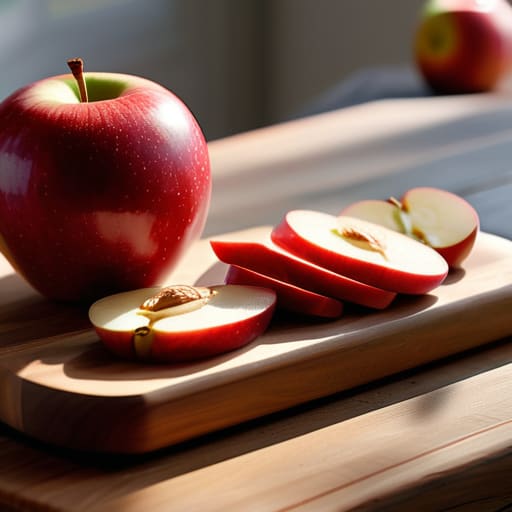
This is one of those classic combinations that actually works for a reason. There’s something incredibly satisfying about the crunch of a fresh apple paired with the creamy richness of peanut butter. It’s a staple in my house because it’s incredibly budget-friendly and requires zero specialized equipment—just a knife and a cutting board.
Hummus and Veggie Sticks
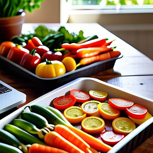
When I’m working from my apartment and feel the urge to mindlessy snack, I reach for the veggie tray. It sounds cliché, but having pre-cut carrots, cucumbers, or bell peppers in the fridge is a total game changer. If the veggies are already washed and ready to go, you’re much more likely to actually eat them instead of grabbing a bag of chips.
Hard-Boiled Eggs
I know, I know—boiling eggs feels like a chore, but if you do a batch on Sunday, you’ve basically automated your nutrition for the rest of the week. I keep a container of them in the fridge at all times. They are the definition of portable; you can grab two on your way out the door and they’re ready to go whenever hunger strikes.
The Bottom Line
Stop overcomplicating it; the best snacks are the ones that require zero prep and actually keep you from crashing mid-afternoon.
Focus on the combo of protein and fiber to stay full longer, rather than just chasing a quick sugar fix.
Keep a few reliable, non-perishable options in your bag or desk so you aren’t forced into expensive, unhealthy convenience store decisions when hunger hits.
The Real Goal of Snacking
“Stop treating healthy eating like a high-stakes project. You don’t need a meal-prepped masterpiece every time hunger hits; you just need a few reliable, low-effort staples that fuel you without stalling your day.”
Julian Reese Miller
Stop Overthinking the Snack
At the end of the day, the goal isn’t to curate a perfect, Instagram-worthy snack platter; it’s about fueling your body so you don’t crash by 3:00 PM. Whether you’re grabbing a handful of almonds, slicing up an apple, or keeping some Greek yogurt in the fridge, the common thread is simplicity. You don’t need a complex recipe or a trip to a specialty health food store to do this right. Just focus on pairing a bit of protein with a bit of fiber, and you’ve already won half the battle. It’s about having a reliable toolkit of options that you can grab without having to stop your momentum or start a massive cleanup project in the kitchen.
I know how it feels when your schedule starts to spiral and the easiest option becomes the vending machine or a bag of processed chips. We’ve all been there. But remember, being “capable” doesn’t mean being perfect; it just means being prepared. Small, intentional choices like these are how you reclaim your energy and your time. Don’t let the pursuit of a “perfect diet” get in the way of actually living your life. Grab something decent, get back to what you were doing, and keep moving forward. You’ve got this.
Frequently Asked Questions
How do I prep these snacks ahead of time so I'm not reaching for junk when I'm actually hungry?
The trick is to stop treating snack prep like a Sunday meal prep marathon. I usually spend about twenty minutes on a Sunday night just portioning things out. Grab some reusable containers or even just small jars, and divide your nuts, dried fruit, or veggie sticks into individual servings. If it’s already in a grab-and-go container, you’ve already won the battle against the vending machine. Keep it simple and keep it visible.
Are there ways to keep these healthy options budget-friendly when grocery prices are spiking?
Look, I get it. Grocery prices are getting ridiculous, and “healthy” shouldn’t mean “expensive.” My rule of thumb? Buy in bulk and stick to the basics. Grab the large bags of nuts or oats instead of the single-serve packs; they’re cheaper and less wasteful. Also, don’t sleep on frozen fruit. It’s just as nutritious as fresh, but it won’t rot in your fridge if you forget about it for three days. Stay smart, stay efficient.
What are some good snack combinations if I'm trying to avoid a mid-afternoon energy crash?
The key to dodging that 3:00 PM slump is pairing a complex carb with a protein or a healthy fat. If you just grab a granola bar, you’re going to spike and then crash hard. Try an apple with some almond butter or a handful of walnuts with some Greek yogurt. It sounds basic, but it keeps your blood sugar steady so you aren’t staring blankly at your screen an hour later.